No matter how much we value good-looking signage and display, function and ease of use should always take precedence – especially when it comes to wayfinding signage. There are some environments where signage function and comprehension are vital. Not everyone can read and not everyone can read English, yet it is important to offer clear guidance in places like schools, hotels, museums, airports and city streets.
Finding help
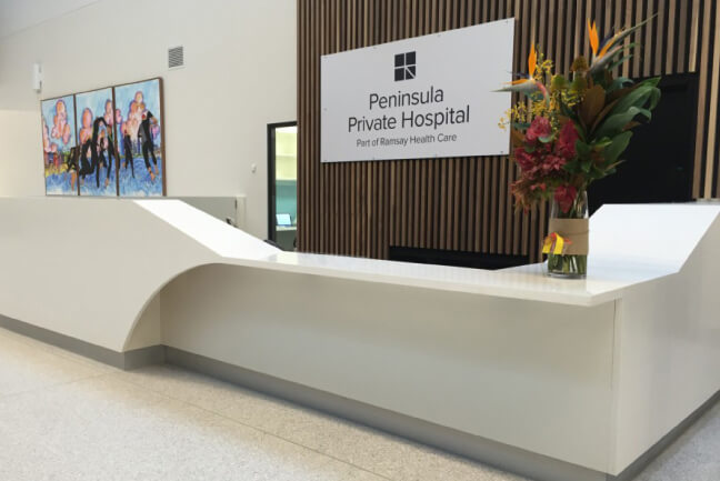
However, it is arguably the healthcare sector that most needs to consider providing signage that doesn’t rely on language to convey meaning.
Imagine walking in the door of the hospital in remote China with an injury. As you fight the pain, you desperately look around for a nurse’s station, a registration desk…or any clue about where you can start getting medical treatment. Instead, all you see are other patients and a sign written in Mandarin characters.
This is the reason why in 2004 a new set of universal graphic symbols for navigating complex health care facilities was developed.
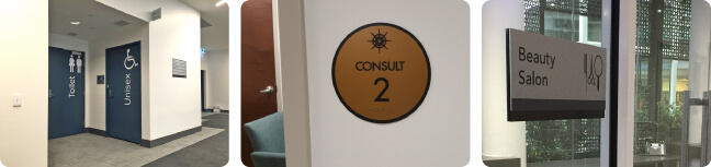
Create wayfinding signage systems that break the language barrier
Whether you’re saving lives or exhibiting works of art, here are some tips for signage that breaks the language barrier to communicate important information:
1. Start with sign design
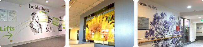
In a perfect world, architects would involve wayfinding sign designers in at the planning stages of a build. Doing so allows the aesthetic and function to work together. For example, architectural elements (like sculptures or uniquely shaped structures) or décor standouts (like murals) can be used as wayfinding points of reference that can be depicted symbolically on maps.
2. Psychologically logical
Contemplate different scenarios that visitors to your space may encounter and formulate a logical wayfinding system that will guide them through quickly and easily. Take into account potential psychological factors – people coming to hospitals may be anxious, and those in airports may be rushed. Your goals are to be simple, yet comprehensive.
3. Design considerations
When it comes to sign aesthetics, keep in mind some basic principles:
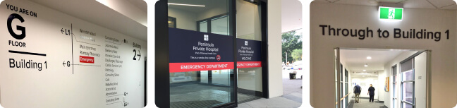
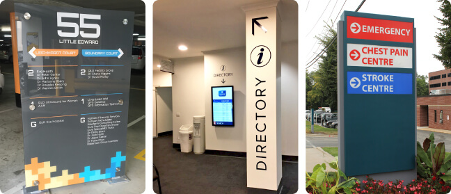
- Use colour to clearly communicate information – for example different colours to distinguish different buildings or departments.
- Use complementary contrasting colours to increase visibility.
- Use symbols but accompany them with simple text for greater legibility.
- Avoid jargon, use words (if you must) that are universally understood or recognised.
- Don’t use more than two fonts.
4. Don’t forget people with disabilities
Include braille and sound cues for the sight-impaired. Consider and indicate wheelchair access points at a suitable viewing height. Consult with medical professionals when designing signage that considers the sensory needs of people with conditions like dementia.
The more consideration and planning that you put into designing your facility, the greater the opportunity to enhance the visitor experience. Talk to us today about how you can introduce signage that addresses and supports your audience regardless of their nationality or ability.