Guest blogger and graphics design student share signage trends and her predictions for the future.
Introducing a guest post by Sherry Mendoza. Sherry is an Australian living in Utah, USA. As part of her degree in graphic design, Sherry explored the history and significance today of signage. She shares her findings with us.
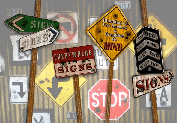
Signs are an expression of artistry, a way to convey a message to the intended audience. You see them everywhere, in fact, if you look around you will probably see one right now. They’re everywhere present in our lives – both hardly noticed and impossible to ignore.
History
To understand the current trends in signage, we need to look at the history. Where did they come from? What were they made of? How have they been used?

In early times, signs would have constituted symbolic cave paintings and etchings or images crafted onto stone or terra cotta. These would have been used as a visual description of primitive life and to advertise a business. People were not literate so this was their method of conveying their messages. There is evidence of advertising executed in stone and on bricks as early as 3000 B.C. For example, early Christians used the image of the cross to establish places to meet.
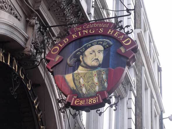
Over the next hundreds of years, as language was born and commerce expanded, the need for signs grew quickly. In 1389, King Richard III passed a law that Republicans had to place a sign in the front of their establishment. To begin with, these signs were all similar in design, but soon people began making their signs more distinct and used logos, symbols, and other imagery that was popular in the day.
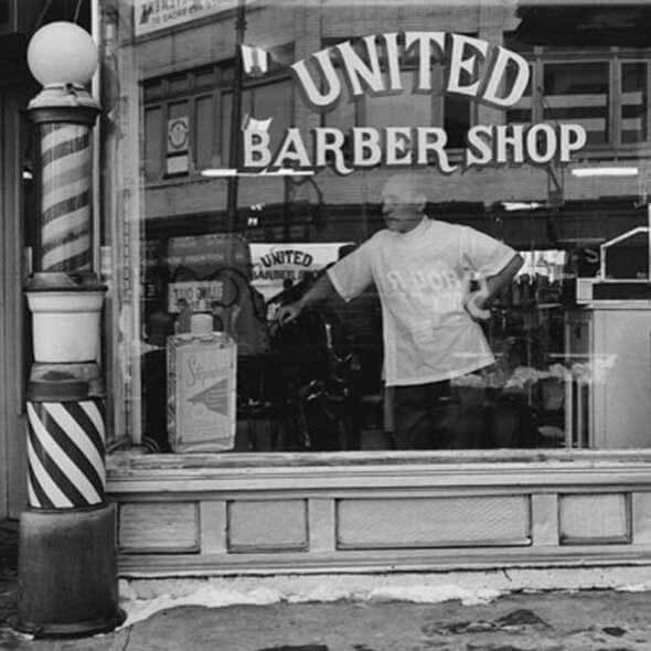
Some of the more recognisable signs, even by today’s standard, were used to sell goods such as the bible (booksellers), key (locksmith), mortar and pestle (apothecary), shoe (shoemaker), sugar loaf (grocer), and, of course, the red and white striped pole of a barber shop.
Signs became increasingly larger and more decorative, and artists used more ornate materials to create them. In the 16th and 17th centuries, signs were created with hand-carved wood, gold leafing, and wrought iron; some of them were almost garish in their design.
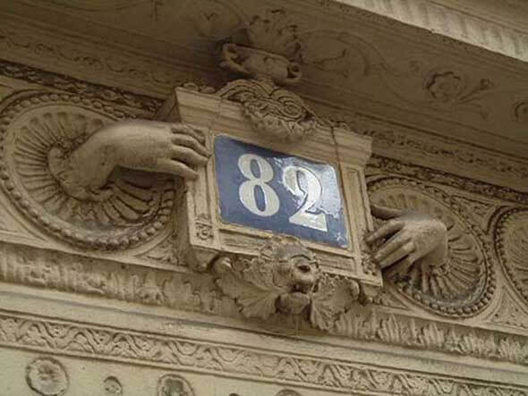
As cities grew, signs were erected pretty much anywhere and everywhere. This practice meant that some signs became unsafe - especially the large signs that hung out over the streets and were in danger of falling. In the 1700s, both London and Paris introduced laws that signs had to be fixed flat against a wall to make for a safer environment.
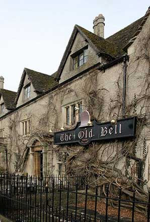
As we moved into the 18th century, new technology made way for a new style of signs that included gas lighting, electricity, and printing presses. This was the early shape of modern signage. There were also many more options available, and creativity started to play a bigger role in sign design that was more attractive to a new breed of business minds.
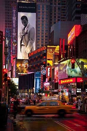
During World War II, mass production of signs began. Better quality materials were available which made it more affordable to print in larger quantities and the industry has grown into what it is today. Today’s usage of signs encompasses advertisement of goods and services, wayfinding, safety hazards, brand promotion, point of sale, and locality to name a few, with better methods used to display them.
The evolution of graphics and styles
The graphic design element of signage is constantly evolving and expanding. Everywhere you look, there are new industrial, retail and urban estates popping up, and with it, the demand for signage for these properties and businesses is increasing also. There is now an opportunity to capture attention via windows, on billboards, along corridors, on vehicles, walls, floors, furniture, equipment and so much more.
So, where to now?
Forecasting trends is a complex process. Look at the fashion industry, where trends keep reinventing themselves every few years. Trends in signage are no different. Colors, styles, and fonts reappear every few years. Currently, the request for simple but eye-catching, effective signage is in high demand. As is what is referred to as ‘retro’ signage. There is also quite a large market for chalkboard style and typography.
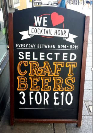
Flat design is not a new concept but it will continue to grow and be of significance in the coming years, with the emphasis on keeping it simple. One of the highlights of flat design is that the designs are solid. I predict we will see less of the patterns, textures, shadows, and gradients that are consistent with realism design concepts.
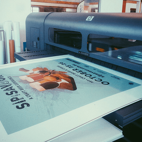
Modern style signage has become extremely popular, especially for professional suites and offices, airports, and high-end shopping malls. In the past, fabricators used to use overhead projectors to trace and paint signs. Then they moved to use very small vinyl cutters to cut piece-by-piece and colour-by-colour followed by layering. Cutting vinyl has been pretty much left behind now in favor of printing via UV and flatbed printers.
The typographical trend of handwritten fonts, large type, and mix and match is also likely to continue on an upward path. Handwritten fonts are cropping up now more than ever before in signage and other media.
Infographics are also an increasingly popular style of graphics that work well on signs. Infographics are a great, simple way to get a lot of information to prospective customers. Many people find infographics fascinating to look at and read, especially when the designer has created something really eye-catching and out of the ordinary.
Regardless of the style, medium, or purpose, for best results, graphic designers and sign solutions providers need to work together to ensure the maximum effectiveness of a sign by understanding current trends, cultural influences, and audience expectations.